
Wednesday, November 25, 2009
Tuesday, November 24, 2009
Turkey Day
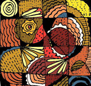
I swear that when I created this doodle in black and white about a week ago, I was not thinking about any particular theme. Today, when I went to add color to it in Photoshop, I decided to use seasonal colors and...well, don't you think it looks turkey-ish? (a turkey on a very bad day, I guess). I don't mean to offend any animal rights activists, but couldn't resist sharing this. Happy Thanksgiving, everyone.
Sunday, November 22, 2009
Colorful Mood
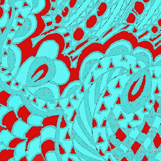
I've been playing around with various kinds of doodling. This one is very loosely based on the concept of a zentangle (a repetitive, meditative, somewhat structured type of doodle, usually in black and white). I originally did this one in black and white, but of course Photoshop tempted me into adding color and effects. I seem to be drawn to combinations of reds and blue-greens lately. I'll probably post more designs along the lines of this one...as usual, I'm addicted...
Thursday, November 12, 2009
Tuesday, November 10, 2009
Italic Calligraphy Online Class
Poppy Collage
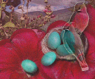
I'm not sure why birds keep showing up in my digital collages--I guess I have quite a few images of them, and they do add some life and movement to the composition. This collage started with a photo that my son Ryan took in China (or maybe Tibet), of a poppy with mountains in the background.(Thanks for the use of the photo, Ryan!) I added the stone wall, more poppy petals, birds, and the nest and spilling eggs. I also applied various special effects, including a "pointillizing" effect as a final touch. I think I need a name for it, but don't have one yet. Suggestions are welcome!
Monday, November 9, 2009
Amazing Effects
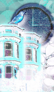
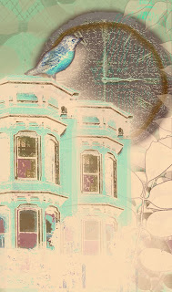
This is the same collage shown in the last posting, with some additional effects applied. In the first one, I applied a layer that inverted all the colors. Cool (literally)! In the second one, I took the inverted version and added a translucent layer of an orange-y hue. The result has sort of a vintage postcard effect to me now. This fun never ends...
Sunday, November 8, 2009
Playing with Reds and Greens
Wednesday, November 4, 2009
Architectural Collage
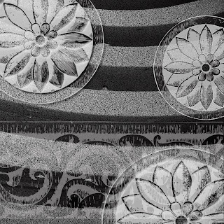
This is a collage I created using a photo I took at the Guggenheim Museum in NYC, and some digital brushes in the form of architectural elements. The curved stripes across the center are the levels of the museum interior as viewed from the lobby; I applied various digital effects to the photo to produce the black-and-white textured design shown.
Subscribe to:
Comments (Atom)


